info@sadi.co.ke
+254727368241
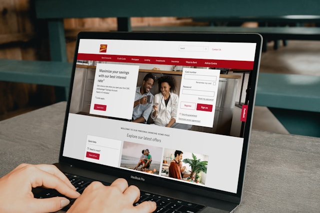
In today’s digital landscape, customers expect fast, smooth, and accessible experiences when browsing websites. With the majority of internet traffic now coming from smartphones and tablets, a mobile-friendly website is no longer a luxury—it’s a necessity.
The Shift to Mobile Browsing
Over the past decade, mobile devices have overtaken desktops as the primary means of accessing the internet. Consumers browse, shop, and interact with businesses on the go, meaning a website that isn’t optimized for smaller screens risks losing a huge share of potential customers.
User Experience Matters
A site that loads slowly, has tiny text, or requires endless pinching and zooming frustrates users. Research shows that visitors leave within seconds if a page isn’t mobile-friendly. On the other hand, a responsive design that adapts to different devices ensures smooth navigation, easy readability, and an overall positive user experience.
Google’s Mobile-First Indexing
Search engines now prioritize mobile versions of websites when ranking results. This means businesses without mobile-optimized sites are at a disadvantage in SEO performance. A mobile-friendly website not only pleases visitors but also improves visibility in search results.
Better Conversions and Engagement
When customers find it easy to browse, read, and purchase from a mobile site, conversion rates naturally increase. Features like click-to-call, simplified forms, and mobile-optimized checkout make the buying process seamless and encourage repeat visits.
Future-Proofing Your Business
As technology evolves, the importance of mobile optimization will only grow. Businesses that invest in responsive design today are better prepared for future shifts in consumer behavior and emerging devices.
A mobile-friendly website is more than just an upgrade—it’s a vital tool for staying competitive, enhancing brand credibility, and meeting customer expectations in a mobile-first world.

 August 21, 2025 - BY Admin